
| 일 | 월 | 화 | 수 | 목 | 금 | 토 |
|---|---|---|---|---|---|---|
| 1 | 2 | 3 | 4 | |||
| 5 | 6 | 7 | 8 | 9 | 10 | 11 |
| 12 | 13 | 14 | 15 | 16 | 17 | 18 |
| 19 | 20 | 21 | 22 | 23 | 24 | 25 |
| 26 | 27 | 28 | 29 | 30 | 31 |
- 취업부트캠프
- 취업부트캠프 5기
- 추천시스템
- NLP
- 특성중요도
- 알고리즘
- MatchSum
- 서비스기획
- BERT
- AARRR
- AWS builders
- 데이터도서
- 딥러닝
- 부트캠프후기
- 유데미부트캠프
- SLASH22
- sql정리
- 토스
- NLU
- 스타터스
- 유데미큐레이션
- 그래프
- pytorch
- SQL
- 유데미코리아
- 임베딩
- 서비스기획부트캠프
- 스타터스부트캠프
- 사이드프로젝트
- 그로스해킹
- Today
- Total
다시 이음
실전 예측 분석 모델링 - 4 Interpreting Machine Learning Model 본문
Interpreting Machine Learning Model ( 머신러닝 모델 해석하기 )
안녕하세요.
오늘은 지금까지 배웠던 머신러닝 모델을 해석할 수 있는 방법에 대해서 다루려고 합니다.
Partial Dependence Plots(PDP)와 Shap value를 통해서 우리는 모델을 해석할 수 있습니다.
이러한 해석과정을 거치는 이유는 모델의 결정 과정을 이해하게 도와주며, 블랙박스라고도 하는 모델안의 결정과정을 해석할 수 없는 경우 신뢰도가 낮아진다고도 생각할 수 있습니다.

Partial Dependence Plots(PDP)
Partial Dependence Plots(PDP)(부분의존도 그래프) 란,
예측모델을 만들었을 때, 어떤 특성(feature)이 예측모델의 타겟변수(target variable)에 어떤 영향을 미쳤는지 알기 위한 그래프입니다. PDP는 회귀문제와 분류문제 모두에 사용할 수 있습니다.
선형모델의 같은 경우, 우리는 회귀계수(coefficient)를 확인하여 타겟과 특성간의 관계에 대해서 쉽게 해석이 가능했습니다.
그러나, 그보다 복잡한 랜덤포레스트, 부스팅 같은 경우는 특성중요도(feature importance) 값을 얻을 수 있지만, 이것을 통해서 우리가 알 수 있는 것은 어떤 특성들이 모델의 성능에 중요하다, 많이 쓰인다는 정보 뿐입니다.
특성의 값에 따라서 타겟값이 증가/감소하느냐와 같은 어떻게 영향을 미치는지에 대한 정보를 알 수 없습니다.
이 때 부분의존도그림(Partial dependence plots, PDP)을 사용하면 관심있는 특성들이 타겟에 어떻게 영향을 주는지 쉽게 파악할 수 있습니다.
그런데 아쉽게도 PDP분석은 특성과 타겟변수의 관계를 전체적으로만 파악할 수 있을뿐 개별 관측치에 대한 설명을 하기에는 부족합니다.
(이를 보완하는 방법은 이따가 배울 Shap value 입니다.)
1. PDP (1 특성 사용)
# 모델 설정하기
from category_encoders import OrdinalEncoder
from sklearn.metrics import r2_score
from xgboost import XGBRegressor

encoder = OrdinalEncoder()
X_train_encoded = encoder.fit_transform(X_train) # 학습데이터
X_val_encoded = encoder.transform(X_val) # 검증데이터

boosting = XGBRegressor(
    n_estimators=1000,
    objective='reg:squarederror', # default
    learning_rate=0.2,
    n_jobs=-1
)

eval_set = [(X_train_encoded, y_train),
            (X_val_encoded, y_val)]

boosting.fit(X_train_encoded, y_train,
          eval_set=eval_set,
          early_stopping_rounds=50
         )
# dpi(dots per inch) 수치를 조정해 이미지 화질을 조정 할 수 있습니다
import matplotlib.pyplot as plt
plt.rcParams['figure.dpi'] = 144
from pdpbox.pdp import pdp_isolate, pdp_plot
feature = '확인하고 싶은 특성 이름'
isolated = pdp_isolate(
model=모델명,
dataset=X_val,
model_features=X_val.columns,
feature=feature,
grid_type='percentile', # default='percentile', or 'equal'
num_grid_points=10 # default=10
)
pdp_plot(isolated, feature_name=feature);
#ICE(Individual Conditional Expectation) curves 표시하기
pdp_plot(isolated
, feature_name=feature
, plot_lines=True # ICE plots
, frac_to_plot=0.001 # or 10 (# 10000 val set * 0.001)
, plot_pts_dist=True) # 데이터 분포도 같이 확인
# 하이퍼 파라미터에 num_grid_points=100을 설정하면 예측 수를 정할 수 있습니다.
# len(데이터)*num_grid_points = 예측수
# frac_to_plot 값으로 그래프에 나타낼 ice개수 비율을 정합니다.
위에 그래프를 보면 ICE(Individual Conditional Expectation) curves 가 같이 표시되어 있습니다.
한 ICE 곡선은 하나의 관측치에 대해 관심 특성을 변화시킴에 따른 타겟값 변화 곡선이고 이 ICE들의 평균이 PDP 입니다.
2. PDP (2 특성 사용)
-heatmap 으로 시각화
from pdpbox.pdp import pdp_interact, pdp_interact_plot

features = ['특성1', '특성2']

interaction = pdp_interact(
    model=boosting,
    dataset=X_val_encoded,
    model_features=X_val.columns,
    features=features
)

pdp_interact_plot(interaction, plot_type='grid',
                  feature_names=features);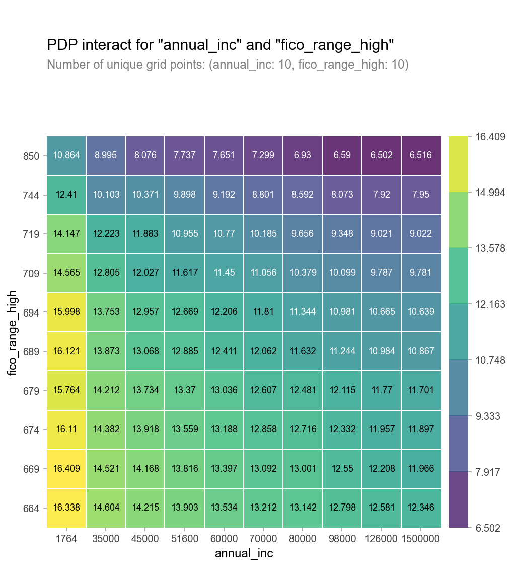
- 3D로 시각화
# 위에서 만든 2D PDP를 테이블로 변환(using Pandas, df.pivot_table)하여 사용합니다

pdp = interaction.pdp.pivot_table(
    values='preds', # interaction['preds']
    columns=features[0],
    index=features[1]
)[::-1] # 인덱스를 역순으로 만드는 slicing입니다

# 양단에 극단적인 annual_inc를 drop 합니다
pdp = pdp.drop(columns=[1764.0, 1500000.0])

#3D 시각화
import plotly.graph_objs as go

surface = go.Surface(
    x=pdp.columns,
    y=pdp.index,
    z=pdp.values
)


layout = go.Layout(
    scene=dict(
        xaxis=dict(title=features[0]),
        yaxis=dict(title=features[1]),
        zaxis=dict(title=target)
    )
)

fig = go.Figure(surface, layout)
fig.show()
- PDP에서 카테고리특성을 사용
우리가 모델 학습시 인코딩 혹은 표준화를 통해 데이터를 변경했다면 PDP를 통해 나오는 값 또한 변경한 값이 나오게 됩니다.
그렇기 때문에 아래의 방법을 통해 PDP 에 인코딩되기 전 카테고리값을 보여주기 위한 방법을 알아 보겠습니다.
# encoder 맵핑을 확인합니다.
encoder.mapping

pdp.pdp_plot(pdp_dist, feature)

# xticks labels 설정을 인코딩된 코드리스트와, 카테고리 값 리스트를 넣어 수동으로 해보겠습니다.
plt.xticks([1, 2], ['male', 'female',]);

# 이번에는 PDP 카테고리값 맵핑을 자동으로 해보겠습니다
feature = 'sex'
for item in encoder.mapping:
    if item['col'] == feature:
        feature_mapping = item['mapping'] # Series

feature_mapping = feature_mapping[feature_mapping.index.dropna()]
category_names = feature_mapping.index.tolist()
category_codes = feature_mapping.values.tolist()

pdp.pdp_plot(pdp_dist, feature)

# xticks labels 설정을 위한 리스트를 직접 넣지 않아도 됩니다
plt.xticks(category_codes, category_names);

# 2D PDP 를 Seaborn Heatmap으로 그리기 위해 데이터프레임으로 만듭니다
pdp = interaction.pdp.pivot_table(
    values='preds',
    columns=features[0],
    index=features[1]
)[::-1]

pdp = pdp.rename(columns=dict(zip(category_codes, category_names)))
plt.figure(figsize=(6,5))
sns.heatmap(pdp, annot=True, fmt='.2f', cmap='viridis')
plt.title('PDP decoded categorical');
SHAP value 라이브러리
어떤 머신러닝 모델이든지 단일 관측치로부터 특성들의 기여도(feature attribution)를 계산하기 위한 방법을 배워 보겠습니다.

Shap 은 개별 관측치에 대한 특성들의 영향을 볼 수 있습니다.
그러나, 특성 갯수가 많아질 수록 Shapley value를 구할 때 필요한 계산량이 기하급수적으로 늘어납니다. 그래서 SHAP에서는 샘플링을 이용해 근사적으로 값을 구합니다. 앞으로 SHAP을 통해 구하는 값은 Shap value라고 부르겠습니다.
1. Force Plot
데이터셋에서 개별 관측치를 하나 선택하여 확인해보겠습니다.
row = X_test.iloc[[1]]  # 중첩 brackets을 사용하면 결과물이 DataFrame입니다
row
# 타겟값
y_test.iloc[[1]] # 2번째 데이터를 사용했습니다
# 모델 예측값
model.predict(row)

# 모델이 이렇게 예측한 이유를 알기 위하여
# SHAP Force Plot을 그려보겠습니다.

import shap

explainer = shap.TreeExplainer(model)
shap_values = explainer.shap_values(row)

shap.initjs()
shap.force_plot(
    base_value=explainer.expected_value,
    shap_values=shap_values,
    features=row
)
위의 Force Plot을 해석해보면, f(x)로 나오는 값은 우리가 뽑은 개별 관측치의 타겟 예측값입니다.
빨간색으로 표시된 특성은 타겟 예측값이 높아지도록 작용한 특성, 파란색은 타겟 예측값을 하락하게 작용한 특성입니다.
개별 관측치를 그룹화(샘플링)하여 사용할 경우에는 하기와 같이 시각화 할 수 있습니다.
# 100개 테스트 샘플에 대해서 각 특성들의 영향을 봅니다. 샘플 수를 너무 크게 잢으면 계산이 오래걸리니 주의하세요.
shap.initjs()
shap_values = explainer.shap_values(X_train.iloc[:100])
shap.force_plot(explainer.expected_value, shap_values, X_train.iloc[:100])
x,y축에 있는 카테고리 설정을 통해서 특성을 변화하면서 확인이 가능합니다.
2. Summary Plot
SHAP plot으로 각 특성이 어떤 값 범위에서 어떤 영향을 주는지 확인할 수 있습니다
shap_values = explainer.shap_values(X_test.iloc[:300])
shap.summary_plot(shap_values, X_test.iloc[:300])
# summary 하이퍼 파라미터값을 plot_type="violin",'bar'로 변경해서 사용 가능합니다.

해석 : 색상 - 파란색 : 특성 기여도가 낮다, 빨간색 : 특성기여도가 높다.
shap value : 음수의 값은 타겟에 미치는 영향이 negative하다. , 양수의 값은 타겟에 미치는 영향이 positive하다.
도트 : 아웃라이어

bar형태의 summary plot은 Feature Importance(특성중요도)와 형태는 비슷하나 특성중요도보다 타겟과 특성과의 관계를 잘 설명해줍니다.
왜냐하면 특성중요도의 경우에는 음의 수는 다루지 않지만, Shap value는 양수,음수의 값을 모두 다루기 때문입니다.
3. 분류모델 해석
import xgboost
import shap

explainer = shap.TreeExplainer(model)
row_processed = processor.transform(row)
shap_values = explainer.shap_values(row_processed)

shap.initjs()
shap.force_plot(
    base_value=explainer.expected_value,
    shap_values=shap_values,
    features=row,
    link='logit' # SHAP value를 확률로 변환해 표시합니다.
)
접은 글에서는 좀더 기능을 추가하여 시각화 할 수 있도록 하는 코드를 담았습니다.
feature_names = row.columns
feature_values = row.values[0]
shaps = pd.Series(shap_values[0], zip(feature_names, feature_values))
pros = shaps.sort_values(ascending=False)[:3].index
cons = shaps.sort_values(ascending=True)[:3].index

print('fully paid 예측에 대한 Positive 요인 Top 3 입니다:')
for i, pro in enumerate(pros, start=1):
    feature_name, feature_value = pro
    print(f'{i}. {feature_name} : {feature_value}')

print('\n')
print('Negative 요인 Top 3 입니다:')
for i, con in enumerate(cons, start=1):
    feature_name, feature_value = con
    print(f'{i}. {feature_name} : {feature_value}')


def explain(row_number):
    positive_class = 'Fully Paid'
    positive_class_index = 1

    # row 값을 변환합니다
    row = X_test.iloc[[row_number]]
    row_processed = processor.transform(row)

    # 예측하고 예측확률을 얻습니다
    pred = model.predict(row_processed)[0]
    pred_proba = model.predict_proba(row_processed)[0, positive_class_index]
    pred_proba *= 100
    if pred != positive_class:
        pred_proba = 100 - pred_proba

    # 예측결과와 확률값을 얻습니다
    print(f'이 대출에 대한 예측결과는 {pred} 으로, 확률은 {pred_proba:.0f}% 입니다.')

    # SHAP를 추가합니다
    shap_values = explainer.shap_values(row_processed)

    # Fully Paid에 대한 top 3 pros, cons를 얻습니다
    feature_names = row.columns
    feature_values = row.values[0]
    shaps = pd.Series(shap_values[0], zip(feature_names, feature_values))
    pros = shaps.sort_values(ascending=False)[:3].index
    cons = shaps.sort_values(ascending=True)[:3].index

    # 예측에 가장 영향을 준 top3
    print('\n')
    print('Positive 영향을 가장 많이 주는 3가지 요인 입니다:')

    evidence = pros if pred == positive_class else cons
    for i, info in enumerate(evidence, start=1):
        feature_name, feature_value = info
        print(f'{i}. {feature_name} : {feature_value}')

    # 예측에 가장 반대적인 영향을 준 요인 top1
    print('\n')
    print('Negative 영향을 가장 많이 주는 3가지 요인 입니다:')

    evidence = cons if pred == positive_class else pros
    for i, info in enumerate(evidence, start=1):
        feature_name, feature_value = info
        print(f'{i}. {feature_name} : {feature_value}')

    # SHAP
    shap.initjs()
    return shap.force_plot(
        base_value=explainer.expected_value,
        shap_values=shap_values,
        features=row,
        link='logit'
    )
특성중요도와 함께 생각해보면 좋은 주제입니다.
특성중요도는 특성들 간의 관계를 설명하는 데에 중점
PDP는 타겟과 특성과의 관계를 설명하는 데에 중점
SHAP은 개별 관측치에 대한 특성들의 관계를 설명하는 데에 중점을 둔다고 정리해보겠습니다.
'AI 일별 공부 정리' 카테고리의 다른 글
| Data Engineering - CLI, Git (0) | 2021.09.10 |
|---|---|
| 실전 예측 분석 모델링 - 5 더 알아보기 (0) | 2021.09.08 |
| 실전 예측 분석 모델링 - 3 Feature Importances & Boosting (0) | 2021.08.27 |
| 실전 예측 분석 모델링 - 2 Data Wrangling (0) | 2021.08.25 |
| 실전 예측 분석 모델링 - 1 ML problems (0) | 2021.08.24 |


